Fun with personal location history
So I wanted to know how much time I spend at work. I have Google track my every step trough android’s location history and I am sitting on a proper treasure of personal data. Also, I am an advertisment product, but that’s besides the point. Sooo, I pulled my location data from location history takeout, started Jupyter notebook and read my location history into a pandas dataframe.
with open('LocationHistory.json', 'r') as fh:
    raw = json.loads(fh.read())

df = (
  pd.DataFrame(raw['locations'])
    .assign(dt = lambda x: pd.to_datetime(x['timestampMs'].astype(int),unit='ms'))
    .sort_values('dt', ascending=True)
    .assign(lat = lambda x: x['latitudeE7']/1E7)
    .assign(lon = lambda x: x['longitudeE7']/1E7)
    .assign(dur = lambda x: x['dt'].diff().dt.total_seconds() / 3600)
    .assign(weekday = lambda x: x['dt'].dt.weekday)
    .assign(dur = lambda x: x['dur'].shift(-1))
    .assign(workday = lambda x: x['weekday'].isin(range(0,5)))
    .filter(regex='dt|lat$|lon$|dur|hour|weekday|workday')
)
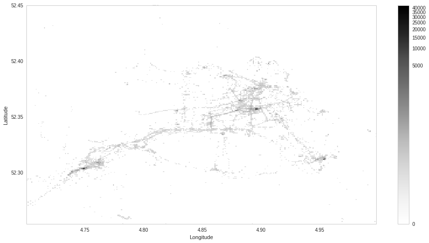
Now we have a list of activities with their durations. How do we map them to work / home / other? Let’s take a look at a histogram of lattitudes and londitudes of the time after I started working at the current position and plot it in 2D.
df_subset = df.query("'2015-09-01' < dt")
_ = plt.hist2d(df_subset['lon'], df_subset['lat'], bins=100,
               norm=mpl.colors.PowerNorm(0.15), cmap=mpl.cm.Greys)
That’s to far away, I must have traveled to different places. Let’s just zoom into Amsterdam.

Ok, it seems most of my activities are logged at three locations, a quick check confirms those are my work and the two places I’ve lived at. Let’s label activities that fit into the area around my work:
work = [52.xxx, 4.xxx]
lat_range = 0.xxx
lon_range = 0.xxx

select_work = (
   (work[0] - lat_range < df['lat']) & (df['lat'] < work[0] + lat_range) &
   (work[1] - lon_range < df['lon']) & (df['lon'] < work[1] + lon_range)
)

df.loc[select_work, 'label'] = 'work'
Etc. for home and other.
Now we can use these labels to see how I’ve spent September 2016:
labeled_location_times = (df
    .query("'2016-09-05' < dt and workday == True")
    .filter(regex='dt|dur|label')
    .groupby([df.dt.dt.date,'label'])
    .sum()
    .reset_index('label')
    .pivot(columns='label')
)['dur']

labeled_location_times.plot(kind='bar')
I’ve spent a lot of time at work this September. Let’s see how much of overtime I usually do:
work_hours = (
    df.query("'2015-09-01' < dt and workday == True and label == 'work'")
      .groupby([df.dt.dt.date])
      .agg({'dur':{'work_hours':'sum'}})['dur']
      .assign(over_hours = lambda x: x['work_hours'] - 8)
      .assign(over_hours_rolling_mean =
              lambda x: x['over_hours'].rolling(10, center=True).mean())
)

ax = work_hours.filter(like='over').plot()
It seems I do a lot of overtime. I should probably get a hobby. So what is my effective hourly rate? What part of hours I work do I get paid for?
(work_hours.loc[pd.to_datetime('2016-02-01').date():]
           .assign(eff = lambda x: 8 / x['work_hours'])
           .mean())
I average 9.45 hours at work per day so my effective hourly rate is 85.7% of my actual hourly rate.
So there you have it! If there is enough interest I will also publish the notebook.